Thursday 29 January 2015

Poster Billing Block research


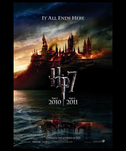
The billing block is the list of names of people associated with the production of a film, they are usually located at the bottom of the page, they are usually found at the bottom of a film poster. They use a condensed font which is all the same height, the font is also capitalised, this enables the billing block to be noticed but still not overwhelm the poster.
The order in which credits are billed signify that person or companies importance. For example the first is usually the motion picture company, then  the producer, usually in the format of 'a..... production. Usually the director comes next, followed by the major stars and the supporting cast. After this those who worked on the film such as screenwriters, production designers, floor managers and sound engineers will be mentioned.


They tend to use discreet colours such as grey or black, sometimes the billing block is the same colour as the background to blend in.


Designers of the posters can use billing blocks to their advantage by using them in a creative way. Posters of films such as vantage point, 27 dresses and 4O days and 40 nights, incorporate the billing block as part of the main image,


A films poster campaign: WWZ and shaun of the dead

For my research into film posters, I have decided to research a specific film poster campaign regarding a film of a similar genre to my own, in this case, WWZ and Shaun of the Dead. These films features campaigns using various poster styles and types to build hype and to gain a wider audience.

Tuesday 27 January 2015

Poster inspiration


From my film poster questionnaire, I have chosen three posters that were popular with my respondents, all of these films are thrillers, however I want to incorporate z-ombie elements in the style of a thriller poster.

Rabbit Hole:

 
This poster uses a form of split screening by dividing the poster in to sections, each section depicts the character showing a range of different emotions, the secondary protagonist also features in three of the sections. The sections are divided by white dividers to create a sense of separatism. The exposure varies in each sector, the central few panels have a bright exposure, therefore audience attention is drawn to this part of the poster. I intend to use various conventions from this poster in my own poster, such as the idea of dividing off sections and replacing them with another image. 


Before I Go To Sleep:


From this poster I intend to utilise the camera angles, the close-ups of the character fill the frame and make direct address to the audience. This poster also uses 'dividers' to separate the characters, suggesting their is internal divisions within the characters lives. I may also utilise the idea of certain sections being black and white, this will make the coloured sections stand out.


The Box:


From this final poster, I intend to replicate the colour scheme. The use of red, white and black is typical to a thriller poster, as found out by my questionnaire. The white makes the text stand out, the black background partially obscures the character, providing a sense of mystery, while the flash of red evokes bloodshed and violence. I intend to deploy certain elements of red in my posters colour scheme, this will probably be used in the text.

A film's poster campaign: The Hunger Games

To research into a specific films poster campaign,  I have chosen to look at the Hunger Games (2012) to see the types of posters they used and how it attracted their chosen audiences.
This slide share is under the account name of a friend from sixth form as I am having a hard time logging into my account, all of this is my work. Here is a link to her blog http://alicepaynea2media.blogspot.co.uk/

Friday 23 January 2015

Photos of the filming locations

Here are a selection of photos and videos from my principal; filming locations.
 
 
  For the bathroom scenes, I used the bathroom at my own house as is has a clean cut modern feel, the lighting is bright allowing the character to be seen clearly by the audience. Also the mirror above the sink allows for an interesting mix of shots to be used showing the reflection, the ring of led's around the mirror also frames the characters face and adds a 'ghostly' blue light around the edge.
For the meeting scenes, I hired out the meeting room at sixth form, this was because it has a corporate feel due to the oversized chairs and large table, this anchored to the corporate feel of the meeting and the costume the 'representative' is wearing. I was able to utilise the light in the room as it had a bright harsh feel to it, making the sequence more unnerving.
For the flashback sequence, I chose to film at Attingham Park, a National Trust park with a stately home. I took some panoramic nature shots to act as establishing shots of the trees and river, then I took photos of my actor by the stately home to infer that is where she lived. The period location and costume infer this scene is filmed in the past.


Thursday 22 January 2015

I am Legend trailer analysis

To analyse generic conventions of z-ombie thriller films, I have chosen to analyse a series of trailers reflecting this genre. Hopefully I will pick up various hints and tips about the use of sound, lighting, camera angles and colour to use in my final project.                

I am legend is a 2007 post apocalyptic action thriller film which incorporates z-ombie themes.


Wednesday 21 January 2015

Choice of music for the trailer

I have sourced the music from a website called http://incompetech.com/music/royalty-free/, you can access royalty free music online and download them easily onto a memory stick or PC. The best trait of this site is that you can browse background music by genre, such as electronic or horror, and feel, such as eerie or aggressive. This is helpful when navigating the enormous database of music. I picked the traits 'horror', 'eerie' and 'unnerving', this helps me find tailor made music to suit the feel of my trailer. This provided me with a more concise list of songs, here is a link to the results
 http://incompetech.com/music/royalty-free/index.html?feels%5B%5D=Eerie&feels%5B%5D=Unnerving. 

Each song shows a detailed description of the overall feel, the length, the instruments used, and the tempo. This helps me gauge how useful it is without even listening to it, thus making the site easier to navigate. You can easily play the music through the site and pause and play when required. 

After looking at the website, I have come up with a rough list of potential soundtracks, the description of it is from the website: 

  • Mirage: A sort of drone-based piece with something that sounds like a waterphone, and some other things that I don't know what they could be. Super chill - good amounts of tension with some glorious consonants.

  • Devastation and revenge: A low hum sets a dark and mysterious mood, but at 0:49 the orchestral strings, horns, and pounding drums begin, perfect as the background to the hero?s dilemma or impending battle scene. At 2:01 the music reaches a climax and builds into discordant, terrifying suspense. The ending, at 2:35, features a lone guitar and mournful vocals, depicting a great sadness and loss.
  • Ghostpocalypse 2, the call:Some dark and low rhythmic elements. Some bits of piano.
  • Lightless dawn:Add a dark intensity to any scene... Is there building action? Is there a clue? Is there a need for ambiguity?
  • Private reflection:Epic myth. Part of the hero's journey. Starts with a solo soprano, and later mixes a full choir. Ends assuming you'll mix it into another piece.
  • Lasting hope: Minimal percussion gives a subtle edge to the smooth synth line
  • With a creation :An experimental piece, designed to emulate a keyboardist with her robot. The piano player likes to play with the EP in this piece. Take a listen to get the full effect. EP used heavily throughout the entire piece. Build at 1:02, percussion picks up with heavy, fast beats.

On reflection, I have decided to go with ghostpocalypse 2, this is because it is roughly the same length as a film trailer should be, but can be edited easily due to the quite elements. It has an unnerving feel and the crescendo at the end will be good at the end of the trailer when a climax is built. Here is a link to the track :
http://incompetech.com/music/royalty-free/index.html?isrc=USUAN1100667

Call sheet two

Here is the call sheet for day two of filming on the 21st of January. 

Tuesday 20 January 2015

poster initial drawing ideas

After analysing various posters, I have come up with various ideas for how to display the text and imagery on the poster. Here are my initial hand drawn drafts. I have used the idea of 'separation' and blocking off various parts of the image from the 'rabbit hole' and 'before I go to sleep' posters.
 
I had the idea of replacing one section of the blocked off image with one of my actress as a z-ombie, this will anchor to the title of my film 'replaced'. I wanted to use a medium closeup image to allow the audience to clearly see the face of the character, a medium closeup infers that she is the main protagonist whilst allowing some of the backdrop to be seen.


The z-ombie makeup process


After watching the tutorials online and looking at articles on the internet, I eventually came up with a z-ombie look that I could build upon (i.e make more gory with progression). I wanted the makeup to reflect the various stages of development. For my trailer, I decided to show three stages, that meant to do three levels of makeup and three different bite marks. Stage one being fairly 'un-dead' whilst stage three being 'extreme' . I used the makeup I mentioned in the post about makeup research to produce a realistic look without looking too fake.

Stage one:
 The makeup here was simply used to make her look unhealthy, I used a mix of a white face paint and a light foundation to gain that 'undead look', as both of these products had a blueish undertone, the overall skin colour looked slightly more 'dead'. I painted on dark circles to give a weary, tired look rather than to make her look like an obvious z-ombie.
For the bite mark, I used special FX products such a ridged collodian and scar wax to give the impression that the mark is sunken into the skin, I didn't want it to look too irritated, just like an old inflamed scar on her arm. This bite mark will provide obvious connotations that she was bitten, and that the film has a z-ombie element to it.


Stage two:

 For stage two, I wanted to show some obvious deterioration, particularly around the eyes. I used eye shadow to hollow out around the eyes and red lipstick under the eyes to give an irritated look. The cheeks are also more sunken in, indicating a recent loss of weight.         For the Bite, I wanted to make it look more sore, using red lipstick to create the impression of inflamed skin combined with purple eye shadow made it look like it is bruised and infected.   


 Stage Three:


For this look, I wanted the character to look like she has lost a lot of weight, therefore I used eye shadow's to shade and contour around the collarbones to create an appearance of malnutrition. To emphasise this, I asked the character to wear a vest to emphasise the makeup and the degradation. To give an even more 'dead' feel, I painted fake veins on her forehead to make the skin look slightly translucent.


For the final stage I also painted the hands to look more decayed, the close ups that will be used in the trailer will emphasise the hands and how they have degraded.


To make the bite mark look more extreme, I painted veins coming out of the bite to look
even more infected. 

photos from the poster photoshoot

Here are the photos from the poster photo-shoot, I wanted to use a mix of close-ups and mid shots to allow the audience to see the entirety of the characters face. I will later decide which ones will feature in my poster after I have drafted my initial ideas.


Film Script for trailer

I have produced a basic film script for the meeting room scene in the trailer. I will hand it out to my cast the day before filming.


INT. MEETING ROOM- DAY

FADE IN (FRIST FEW LINES WILL BE USED AS A VOICEOVER FOR COMPANY LOGOS OR OTHER SHOTS)

JOSEPHINE is meeting a representative from the undead liaison office in a meeting room to discuss her treatment. The scene starts when she is recording a video diary stating her personal details. Both characters are facing each other at opposite ends of the table.


(VOICEOVER)REPRESENTTIVE

Can you state you’re name, age and current condition?

(VOICEOVER)JOSEPHINE

My name is Josephine Lewis, I am 125 years old, I became infected in the year 1912 aged 22 and I am in a stable condition

CUT TO MEETING.

REPRESENTITIVE

We’re here to discuss your prolonged treatment of the Hyronamide drug, which, as far as I can tell seems to be causing you no problems

Pauses to tick something on a sheet of paper

I would like to discuss the termination of your treatment starting from today, due to recent cuts, which I cannot (pauses) discuss, one pill per day will be removed until you are free of the treatment.

JOSEPHINE

(Concerned)

Are you sure this is safe? Their won’t be any side effects will there?

REPRESENTITIVE

I can assure you that the termination will be as safe (cut to JOSEPHINE in bathroom) and controlled as possible (Cut to her in bathroom again


Monday 19 January 2015

poster survey

I have created a survey on survey monkey to help me find out what audiences look for in film posters, mainly in the z-ombie thriller genre.
Click the link to view the survey
https://www.surveymonkey.com/s/6J9YSJC

Sunday 18 January 2015

Protagonists final costume

Here are the final costumes I have chosen to use in my film trailer for the protagonist. I will analyse why I have chose certain elements of the costume.


Here are some other photos of the costume for the flashback sequence, I decided to also include a cardigan over the top of the shirt as we were filming outside therefore it might be cold.


Friday 16 January 2015

Call sheet: Day 1 filming

Here is a call sheet I created for my first day of filming, January the 18th.

Thursday 15 January 2015

Codes and conventions of film posters

I have researched various codes and conventions for film posters. I will look in more depth at conventions of posters of my genre at a later date.
click on the link below.

http://www.flipsnack.com/erincakemuse/codes-and-conventions-of-a-film-poster.html

Monday 12 January 2015

Audience profile

It is important for a films distributors to research the audience for a film, each film has to be treated as an individual product. Even though it is vital to never lose sight of the audience, the distributors will try to attract as many people as possible. The unique selling point/s of the film will help audiences understand what they might expect when they go and see a film, the visual campaign (posters etc.) will stress this USP. To understand the potential target audience, I need to create a target audience profile, to explore the details as to what an audience member might be interested it.

Name: Gemma Eisenberg
Age:18
Gender: Female
Young and Rubicam's four consumers: Reformers-they Define themselves by their self-esteem and self-fulfilment.
Income bracket: category 'E', as she is a student she will be placed in this category, however my film will aim to attract those in the B and E categories.
Lifestyle: currently a student studying media, IT and business studies. She has a fairly active lifestyle, mixing swimming and going to the cinema with her studying. 
Activities: She enjoys browsing the internet and uses a fair few social media sites therefore she will be more engaged with online film marketing. She likes to watch films and go to the cinema with her friends whilst drawing and taking photographs in her spare time.

My target audience will be aged between 17-30 years old, from my questionnaire I found out that the majority of people from this age group liked films from a thriller genre, they watch thriller films and enjoy films with suspense in the plotline. I did find that people of this age group didn't prefer z-ombie films as a genre, I wish to change this stereotype by adding thriller elements to a z-ombie film to make it more appealing and to subvert the violent stereotypes that z-ombie films portray.

Both males and females will be attracted will be attracted to my film because of the plotline, males often prefer films with violent, scary and z-ombie themes, whilst females will relate to a female protagonist. The 15 rating will open up a wide potential market as films rated a 15 are consistently popular in the cinema and on DVD, 18 films on the other hand are more popular on dvd only.  

My audience will take an active role in the films marketing process, as they are online more than other demographics, therefore I will adopt a below the line online marketing scheme using sites like Facebook and instagram to virally market my film. My film will be aimed at people who are actively interested in film, i.e. they read film magazines and articles, watch trailers frequently and regularly go to the cinema, this means they will be interested in and appreciate a hybrid genre with an unusual plotline as they are more likely to watch films with less generic outcomes and plots that defy the narratology theories.

Types of film poster

In the film industry their are a fair few types of film poster, here I will be talking about the general release types.

Teaser poster:


A teaser poster or advance poster is an early promotional film poster, it often contains a basic image or design enabling the marketers to build hype without revealing too much information. The general purpose is to create brand/film awareness as the poster often features a date at the bottom. A tagline may sometimes be included to create a sense of iconography, for example in 'The Dark Knight' poster, a catchphrase is used to generate audience excitement. They often contain an iconography symbol associated with the film, this will make future posters, trailers and dvd covers more memorable as they stick to a specific corporate image. Sometimes they just bear the title, this is often if the film is an adaptation of a well known source, recognition will be achieved by this. The use of simple fonts, imagery and colour blocking make the poster more memorable and symbolic. These types of poster often feature the main character, looking away from the screen but looking at something in the distance, or in the case of the Bond poster, a simple outline of the character will suffice to gain audience recognition.


Character poster:


Often, films with an ensemble cast may release a series of  character posters, each featuring an individual character from the film. For reference it includes the characters name and/or the name of the actor. This allows the audience to build up a relationship with each character. Also, the character may be wearing a particular symbolic costume or feature in front of a background/setting relatable to them, this creates a recognisable corporate image for that character.

Theatrical poster:

These are the posters that are shown nearer the date of the films release or when it is playing at the cinema. This type of film poster give away key info about the plot, characters, actors and location. They are the most vital type of poster for the marketing companies as the audience will take more notice of them, therefore the company has to go all out of effects and photography to bombard the reader with information.  

Friday 9 January 2015

Existing Thriller posters moodboard

To gain an insight into posters of a thriller genre, I have created a mood board of posters to identify conventions of thriller posters (this will be in a later post.)
Thriller films poster moodboard

Viral marketing

For my film, I hope to utilise a viral marketing campaign to 'get in touch' with my younger audience who are more in tune with technology therefore will be more likely to be effected by a viral campaign. Viral campaigns use marketing techniques that utilise pre-existing social networking technologies to gain an increase in brand awareness. It's often spread by word of mouth or through viral effects of the Internet and mobile networks. Viral advertising often does not mean businesses pays for its distribution. Most viral advertisement are paid by a sponsor company, launched either on their own platform (company webpage or social media profile) or on social media websites such as YouTube.   

Case study: The Hunger Games Mockingjay part 1:
The viral marketing campaign began in June, 2014 with the reinstatement of TheCapitol.PN a "government" website for Panem which was used throughout the promotion for the previous two films, this creates a virtual realism experience for the audience as if the Hunger Games world really exists. 

Also, in conjunction with Yahoo and Tumblr, they released the 'District Heroes Collection' which featured several character posters representing seven of the thirteen districts in Panem. Also, the website opened registrations for "citizens of Panem" to register with their email to receive updates for Capitol TV, this therefore creates active audience participation to get involved with the marketing of the film.


The marketing company released a series of 'propaganda videos' to again create a sense of realism, in June 25, TheCapitol.PN site released a video titled "President Snow's Address - 'Together As One'" featuring a speech by Donald Sutherland, in character as President Snow addressing the citizens of Panem. The video went viral on YouTube
Two weeks later on July 9, Capitol TV released a second viral video titled 'President Snow's Address - Unity' featuring another speech by President Snow with Peeta Mellark standing beside him, but this time accompanied by Jena Malone in character as Johanna Mason. The speech, however, was interrupted by Jeffrey Wright, in character as Beetee Latier, a technician from District 13, to announce that "the Mockingjay lives. This was part of the teaser process for the film as a small part of the films plot was released, this was designed to build up extensive hype, also "Within minutes, #TheMockingjayLives and '#2 - Unity' became the top two trending topics worldwide on Twitter.


Shortly before the trailer's official release, a teaser poster for the movie was posted on The Capitol's Instagram account, but was soon quickly deleted. Shortly after the removal of the poster, the account issued an apology " for the technical issues", presenting the poster's posting as a hack from the District 13 rebellions, this would obviously create extensive hype as people who are fans of the books and films will share the trailer with others.


On July 28, the teaser trailer officially debuted online through the film's official Facebook page and YouTube account, soon after the film was trending worldwide as views of the video soared. This shows a clever way of making use of social network sites to market a film, the use of these sites has a multiplier effect in the sense that the audience can market the film themselves through sharing the links.


The website introduced new posters for the District 13 characters including Beetee, Coin, Plutarch, Finnick, Haymitch and Effie, and then a series of posters featuring Gale, Katniss, Cressida, Boggs, Pollux and the rest of the 'film crew' in the film. This series of character posters creates an individual portrayal of each character, and represents them in key with the location in which they belong.

Thursday 8 January 2015

obstacles

I have recently encountered a few obstacles:

A main one was that I was not able to download fonts online due to security issues, websites such as Da fonts which provide a wide range of unique fonts suitable for my poster, trailer and magazine, prevented me from downloading fonts. The only other way of acquiring fonts is using the fonts preinstalled on photo shop and fireworks, or screenshotting the font from da fonts and editing it in post production on fireworks, often a lengthy process.


Film trailer storyboard

I have created a hand drawn storyboard for my film trailer. Its just a rough outline showing how the story will progress. I have labelled the image as my handwriting may not be legible. 

Tuesday 6 January 2015

Styling moodboard

Here is a moodboard I have created on pinterest regarding the styling of my characters. This will regard both makeup and hair. As I have only featured two characters in my trailer I wanted to go into great depth on their overall styling. I wanted my protagonist to look relaxed but her clothing will also make her blend in. The government official will be wearing a formal business suit to make her look professional. I have used the visual discovery tool pinterest to gather my initial ideas.  Follow Erin's board Trailer styling board on Pinterest.

Monday 5 January 2015

Poster Analysis: thriller

I have chosen to analyse a very typical thriller poster, TAKEN. This classic thriller starring Liam Neeson really shows some typical conventions of a thriller film poster.