This prezi contains step by step processes for my poster. It shows all of my drafts as this prezi was an on-going document over the course of making the poster. I screen-shotted my poster every time I made a change and added it to this prezi.
Here the process of draft one and two is shown:
Thursday, 19 March 2015
Tuesday, 10 March 2015
Photography used in film magazines
Here, I am going to research the types of photography used in film magazines. I will analyse different main images used in different film magazines and their effects on the audience. After looking at various magazine covers, the style of the main image often differs depending on the film advertised.
Sunday, 8 March 2015
Creating a billing block
When creating the billing block I type the text below into a billing block generator. I will then edit the colour of the text on Photoshop if needed. Most of the names are fake as it would look ridiculous if I kept repeating Erin Harper.
PICTURE PICTURE ENTERTAINMENT PRESENTS ‘REPLACED’ FAYE WIGGINS WITH CHLOE BULLOCK EDITOR KAYLA BLAIR PRODUCTION DESIGNER TERENCE BRADLEY DIRECTOR OF PHOTOGRAPHY DAN SCOTT EXECTUIVE PRODUCERS KATHERINE ROGERS RUSSELL THOMPSON MARIE ADAMS PRODUCED BY ERIN HARPER ALAN TAYLOR GEMMA BECKETT SCREENPLAY BY ERIN HARPER AND BETH LACEY DIRECTED BY ERIN HARPER
As you can't download a billing block generator at school, I found similar condensed fonts of fireworks I wish to use. For my final poster production process, I will create the billing block using these fonts and condense as appropriate.
Wednesday, 4 March 2015
My secondary images
After looking at various film magazines, I noticed that several secondary images are featured. Here are the images I will use on the front cover, all portray films of a thriller genre as my magazine will be a thriller special.
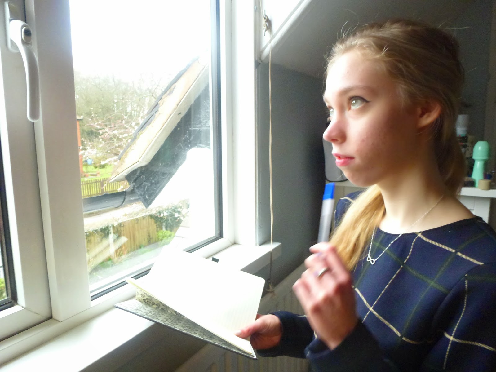
This image is a mid-shot, therefore allowing the audience to see all of the actor. As she is placed to the right of the frame, the emphasis is also on the window she is looking out of. High key natural lighting is also used to maximize brightness and to enhance the shadows on the actresses face. This light and shadow effect makes the actress look sinister as she is in shadow, this connotes to the pen and book she is using, suggesting she has a plan or initiative. The overall picture creates a sense of mystery as the audience wants to know what she is writing/planning.

This image is again a mid shot so the audience gets a clear picture of the surroundings and the actors face. Here, the actor is looking round a door with a scared expression on her face, this could infer that she is being cautious or has seen something 'secret'. High key lighting emphasises the shadows, I achieved this by using the flash on my camera. The 'looking behind the door' pose is a pose typical to a horror or thriller film, therefore the audience can recognise the genre without much more information.

This image provides an obvious connotation with the title. She is seen about to walk through a metal gate, perhaps into an unknown place. This looks like she is running from something or someone. Natural lighting gives an overall ethereal glow to the image whilst the mid shot gives the audience a clear view of the actors facial expression. The title evokes the films genre, a thriller, because of the fast paced connotations. As she is looking directly at the camera, the audience connects with the character.

This image is obviously connoted to the title. I used an image of three people instead of one, this creates more interest. To attract a male audience also, I used males in the image. This image is high action based as I took the image under natural circumstances (i.e not a specialised photo shoot like the other images), therefore it looks like a still from a film.
Film magazine cover analysis:
Here I have analysed two magazine covers, one from TOTAL FILM, and one from EMPIRE. I have analysed them in terms of layout, imagery, colour, typography and persuasive devices. Click the link below.
http://www.flipsnack.com/F68BDCC7C6F/analysis.html
http://www.flipsnack.com/F68BDCC7C6F/analysis.html
Tuesday, 3 March 2015
Extra conventions
After doing some more extensive research on film magazines, I have been able to establish some more conventions.
Pull quotes: pull quotes are direct quotes from an actor or director used on the front cover in place of a secondary lead. They are usually 'pulled' from the corresponding interview in the magazine. They give the reader an insight into the content of the magazine, thus promoting interest.
Cover lines: magazine cover lines are pieces of text designed to provide information to the reader. They act as previews of certain articles inside the magazine.
pugs: these are small elements of the magazine designed to catch the readers attention. They are usually placed at the top right hand corner and feature the price, logo or issue number.
puffs : puffs are small puffs of information with the intention to grab attention. They display unique aspects of the magazine that may benefit the reader, for example a competition may be advertised or a collectors edition cover. They are usually placed in circular box outs to distinguish themselves from the rest of the text.
Kicker: the kicker is a story designed to stand out from the rest of the page, this could be due to a different font, a different colour or layout
Headline: the headline is the main statement regarding the main film presented on the cover. It is usually in the biggest font and spans the width of the cover; acting like a banner.
Box out: A box out is designed to highlight the importance of certain texts. It is usually a coloured box placed behind the text, designed to make the text stand out. Usually the box out is a contrasting colour from the text.
Sunday, 1 March 2015
Font research for magazine
To produce my magazine, I need to take into consideration the fonts I will be using for each aspect of the text. After looking at different magazines, I have noticed that not all fonts are constant
Here is a font mood board for fonts to use on the MASTHEAD:
 To establish a firm corporate image thorough my tasks, I have chosen bold, sans-serif fonts to keep within the modern theme. These bold fonts will be good as a masthead as they can be easily edited if needed. Because of their size, they can stretch across the top of the cover when the text features minimal words (i.e. it doesn't need loads of words to fill the space, one word or two will suffice). I have narrowed it down to the 'ELKWOOD' font and the 'LEMON MILK' font due to their modern and professional feel.
HEADLINE :
I didn't feel like I needed a mood board for my headline as I know which font I will use. I have chosen, Tw Cen MT Condensed, this font will create a coherent corporate image because it is the same condensed font I used for the billing block on my poster. The condensed font evokes a cinematic feel as it is similar to the condensed fonts used on film posters. On its own it looks pretty plain, but I plan to edit it by changing the colour, size and adding a shadow to make it look more unique.
Here is a font mood board for fonts to use on the MASTHEAD:
HEADLINE :
I didn't feel like I needed a mood board for my headline as I know which font I will use. I have chosen, Tw Cen MT Condensed, this font will create a coherent corporate image because it is the same condensed font I used for the billing block on my poster. The condensed font evokes a cinematic feel as it is similar to the condensed fonts used on film posters. On its own it looks pretty plain, but I plan to edit it by changing the colour, size and adding a shadow to make it look more unique.
Subscribe to:
Posts (Atom)