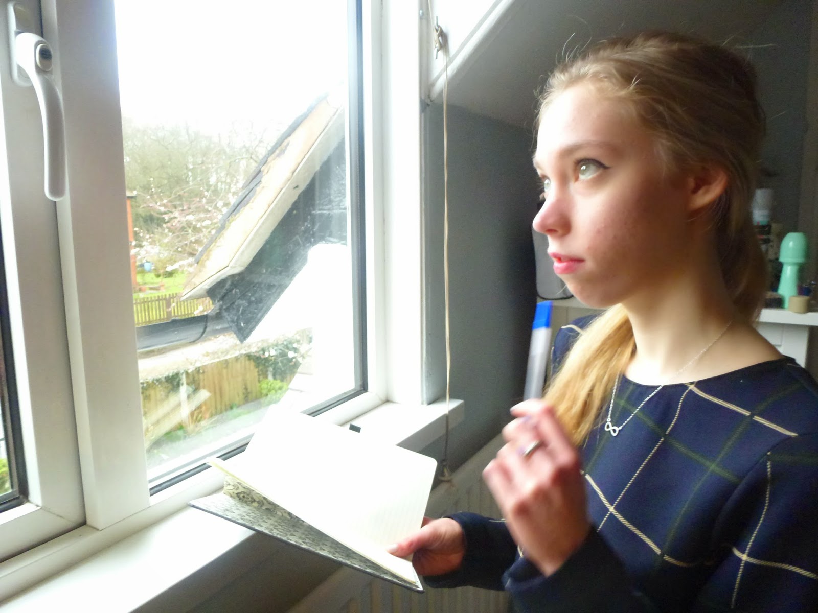
After looking at various film magazines, I noticed that several secondary images are featured. Here are the images I will use on the front cover, all portray films of a thriller genre as my magazine will be a thriller special.
This image is a mid-shot, therefore allowing the audience to see all of the actor. As she is placed to the right of the frame, the emphasis is also on the window she is looking out of. High key natural lighting is also used to maximize brightness and to enhance the shadows on the actresses face. This light and shadow effect makes the actress look sinister as she is in shadow, this connotes to the pen and book she is using, suggesting she has a plan or initiative. The overall picture creates a sense of mystery as the audience wants to know what she is writing/planning.
Secret decay:
This image is again a mid shot so the audience gets a clear picture of the surroundings and the actors face. Here, the actor is looking round a door with a scared expression on her face, this could infer that she is being cautious or has seen something 'secret'. High key lighting emphasises the shadows, I achieved this by using the flash on my camera. The 'looking behind the door' pose is a pose typical to a horror or thriller film, therefore the audience can recognise the genre without much more information.
Runaway:
This image provides an obvious connotation with the title. She is seen about to walk through a metal gate, perhaps into an unknown place. This looks like she is running from something or someone. Natural lighting gives an overall ethereal glow to the image whilst the mid shot gives the audience a clear view of the actors facial expression. The title evokes the films genre, a thriller, because of the fast paced connotations. As she is looking directly at the camera, the audience connects with the character.
Coffee Break:
This image is obviously connoted to the title. I used an image of three people instead of one, this creates more interest. To attract a male audience also, I used males in the image. This image is high action based as I took the image under natural circumstances (i.e not a specialised photo shoot like the other images), therefore it looks like a still from a film.


No comments:
Post a Comment