Here is a mindmap for my evaluation question four
'How did you use media technologies in the construction and research, planning and evaluation stages?
Tuesday, 14 April 2015
Sunday, 12 April 2015
Saturday, 11 April 2015
Evaluation question three
I created a video on windows moviemaker then uploaded it in two parts to youtube.
Friday, 10 April 2015
Evaluation question one: In what ways does your media product use, develop or challenge forms and conventions of real media products?
In what ways does your media product use, develop or challenge forms and conventions of real media products?
Thursday, 2 April 2015
Wednesday, 1 April 2015
final poster
Here is my completed poster, as you can see I have made a few changes. After looking at the way the image is broken up, I felt that lines were needed to separate the sections even more. Using the line tool, I added thin white lines on each join. I also felt that in my previous draft, the joins between the sections were very untidy, I amended this by re-editing the original image more neatly than simply placing it back under the text. I also moved the headline down as I felt it was too near the middle of the poster.
Now that I am happy with my poster, here is a detailed analysis of it:
.jpg)
Main image:the main image is a medium closeup of the actor. This enables the audience to see the facial details of the character, this is further emphasized by the direct address the actor is making at the camera. Using sections from two image, one of the artist in a stable state and one of her as a z-ombie is further emphasized by white lines at the join to each section. The editing of the eyes makes the image look both shocking and intriguing, this invites the audience in and opens up the possibility for discussion.
Headline: The headline, or main title is located at the bottom of the page, a typical convention for a film poster, this also ensures the image takes pride of place. I used a duplicate font technique to make it stand out from the page. Using a darker colour at the bottom makes the text three dimensional. Using a sans-serif font gives the poster an overall modern look, with a harsh edge, this relates to the harshness of the society my protagonist lives in.
Tagline: I chose to use the popular idiom 'on the doctors orders' as my tagline. I subverted the typical positive connotations this phrase has and gave it a negative spin. This creates an almost shocking and intriguing effect of the audience, therefore they will want to find out more about the film.
Release date:I decided to be fairly specific about the release date, stating the season the film will be released in. Unusually, I placed the date within the context of a tagline, this gives the date more interest. To emphasis the date even further, I made the text red. As the only element of red on the page, it is bound to stand out.
Company logos and billing block:As these elements are typical conventions for film posters, I decided to place them at the bottom of the page as normal. However, I changed the colour to an off white, similar to that used in the headline, this creates a colour scheme and a more coherent poster.
Film awards:As a persuasive device, I included film awards that are commonly given to independant films. This will attract film fans of indepandamt or indie films and set high standards for the film without the audience having to watch it.
Final magazine analysis
Here an analysis of my final magazine. I decided not to make any changes from my final draft as I feel it is effective as a piece of film marketing. I did try to edit the secondary images to make the heads of the individuals overlap with the 'film strip to make them look 3D, however I would have to have got rid of the picture captions, a vital part of the cover.

Main image:
The main image conforms to typical conventions of a film magazine. Using a medium closeup shot enables the audience to see the face of the actress and the background. As some of the background is free, room is left for the coverlines to frame the face of the actor. The image uses high key natural lighting to give the actor that 'ethereal' glow. As she is looking directly at the camera, she is making a form of direct address to the audience, this establishes a bond in some ways. To make the image jump from the page, it overlaps the masthead slightly. I subverted conventions of the main image by using a photo of the actor not in character, this emphasises the realism effect I am going for as my magazine is an independent film magazine.
Headline:
The headline, like regular film magazines is located roughly in the middle of the poster, this draws the audiences gaze to it. I used the same sans-serif font and 'shadowing' style like I used for the poster, this creates a recognisable motif for the film advertised. I placed it on the diagonal to parallel the strip of secondary images, this ensures coherence thorough the page.
Masthead:
The masthead uses a similar sans-serif font as magazines TOTAL FILM and EMPIRE, this makes my magazine recognisable as audiences realise it is a film magazine. This is further highlighted by the editing of the letter 'I' into a film strip. The title itself relates to the topic of the magazine, 'film' and the 'REEL' part refers to the REAL films (independent films) featured.
Secondary images:
I used both EMPIRE and TOTAL FILM for inspiration for the layout of the secondary images. I placed them in a film strip format on the diagonal. using A boxout also distinguishes the secondary images form the main image. I used a mix of medium closeups and long shots to show stills from actual films. These actions shots create excitement, this is reinforced by the picture captions used to indicate the film shown. I used the banner style coverline to advertise the contents of the magazine, stating it is an ultimate summer guide. This anchors to the secondary images as they will obviously be part of this 'summer guide'.
Colour Scheme:
After looking at my questionnaires, I discovered that the audience preferred my scheme of red, off white and green/grey as it gives a subtle tone to the cover. Red and white both contrast well, this is highlighted by the bright green background which also provides a colour contrast. The colour scheme also reflects the scheme of my film, this is a common convention of film magazines as the scheme of the magazine often reflects the distinct scheme if the main film featured (E.g TOTAL FILM using red, white and blue to advertise captain America.)
Cover-lines:
The cover lines in my magazine have a referential function to provide information to the reader. in my magazines case, the larger the cover line, the more important the article. I used the colours red an white to distinguish the text. To separate elements of the cover lines, I used red lines to separate them. Some of the cover lines feature buzzwords such as 'ultimate' and 'plus', to distinguish the m further I used a different font, weight of font, size or colour. I also included a tagline just below the masthead to summarise the objectives of the magazine.
Puff/pug:
The puff of information on the right hand side advertises a competition. This is further emphasised by the use of a boxout to separate the puff from the rest of the cover. I edited the circle to look like a peeling sticker, this makes it stand out from the page. I used a different font for the buzzword 'WIN' to also catch the readers attention.
Skyline:
Like most magazine covers, I used a skyline to set the premise of the issue. I have used it to summarise the issues contents. It features that the magazine is a thriller special, this will attract certain fans of a thriller genre. To make it stand out, I placed the text on a white boxout. The buzzword 'Exclusive' is in red, this further highlights the buzzwords function.
Evaluation questionnaire
I used survey monkey to collect some feedback for my evaluation
https://www.surveymonkey.com/s/T33MYV9
https://www.surveymonkey.com/s/T33MYV9
Tuesday, 31 March 2015
analysis of my trailer
Here is a link to my trailer analysis https://docs.google.com/presentation/d/1ow7zWpml0RVnBkYfIYzqD2FK53FFnM9gd5QqYBXFwVg/edit?usp=sharing
Monday, 30 March 2015
Font selection for magazine
For my magazine, I decided to restrict my fonts to around four different ones. Using a niche number of fonts makes the magazine more simplistic, thus maximising the persuasive effects
ELKWOOD: http://www.dafont.com/elkwood.font I sourced g=his sans-serif font from the website da fonts. As this font is the largest and has the most impact, I decided to make it my masthead. The large width enables me to stretch it across the width of the page without it looking distorted
Tw Cen MT Condensed Extra Bold: this is the font I used for all my cover lines and subhead lines. Its compact style means I can easily pack more information on the cover without it looking overcrowded. As it is the same style font used on billing block credits on film posters, it will subtly echo the film genre.
Book Antiqua:I used this old fashioned serif font for the buzzword 'plus', this distinguishes it from the rest of the sans-serif modern text.
Rosewood Std: This 'circus style' font was used for the buzzword 'win'. As this was located on a puff for a competition, I wanted the text to stand out. The detailed font also captures the eye as everything else on the magazine is quite clean cut and modern.
Friday, 27 March 2015
Wednesday, 25 March 2015
Film magazine survey results
Here is the link for the results of my film magazine survey, click the link below :)
https://docs.google.com/presentation/d/1vrTLPUn4A0GQIxgkJyLAMwdtWvVC4dZ5cI_bG5If4MQ/edit?usp=sharing
https://docs.google.com/presentation/d/1vrTLPUn4A0GQIxgkJyLAMwdtWvVC4dZ5cI_bG5If4MQ/edit?usp=sharing
Friday, 20 March 2015
colour research for magazine
As part of the research for my magazine, I have decided to research various colour pallets for different magazine covers. This will therefore help me to establish a colour pallet for my own magazine.


This issue of TOTAL FILM uses a very strong colour pallet relating to the main film featured, Captain America. The film itself features the patriotic character of Captain America, who embodies the colours of the American flag, red, white and blue. To create cohesion thorough the cover, a bright red is used on the masthead and box out behind the secondary images. The blue is used for the skyline and cover lines, while the white is used on the headline and cover lines. The black is used solely on the puff at the top of the cover. These three colours give a patriotic feel to the cover and strongly symbolises the key themes of the film, heroism, bravery and patriotism to the American flag.


The colour scheme for this issue of TOTAL FILM uses a luminous colour scheme of aqua blues and fuchsia pinks to link to the garish colours used on the poster for the film featured, Inherent Vice. The pink is used on the masthead to give a luminous neon light effect, it is also used as an accent colour on the cover line 'world exclusive' and as box outs to the picture captions. The blue is again featured as a neon light effect but used on the headline and skyline instead. White is used as the accent colour on the cover lines and the puffs. Overall the three colours create a luminous feel to the cover and adds a 'gaudy' look to connote to the 'gaudy' colours used in the film.

For my film magazine, I have decided to use a colour scheme relating to that of my poster. After looking at other magazines I have noticed that the colour schemes on the cover relates to the colour scheme of the film featured. This helps creates an overall theme to the cover. My colour pallet features a blood red colour to link to the violent/gory themes in my film. A grey/green off white colour will relate to the colours used on the masthead of the poster. I will then use a white colour on the masthead and as an accent colour on some of the coverlines.
Thursday, 19 March 2015
Change to plotline
Just a quick update, I have made a small change to the plotline by removing the mugging scene. This was because it didn't really fit with my trailer and plotline. I felt it was an unnecessary element because it would deviate from the main focus of the trailer and give too much away to the audience about what happens to the character.
Creating trailer end credits
After researching the various codes and conventions of film trailers, I have noticed that they feature end credits. These feature a billing block of the cast and crew followed by a release date with a tagline. These are featured at the end of the film trailer to provide the viewer with crucial information regarding the film, placing the information at the end makes it more memorable.
Poster production
This prezi contains step by step processes for my poster. It shows all of my drafts as this prezi was an on-going document over the course of making the poster. I screen-shotted my poster every time I made a change and added it to this prezi.
Here the process of draft one and two is shown:
Here the process of draft one and two is shown:
Tuesday, 10 March 2015
Photography used in film magazines
Here, I am going to research the types of photography used in film magazines. I will analyse different main images used in different film magazines and their effects on the audience. After looking at various magazine covers, the style of the main image often differs depending on the film advertised.
Sunday, 8 March 2015
Creating a billing block
When creating the billing block I type the text below into a billing block generator. I will then edit the colour of the text on Photoshop if needed. Most of the names are fake as it would look ridiculous if I kept repeating Erin Harper.
PICTURE PICTURE ENTERTAINMENT PRESENTS ‘REPLACED’ FAYE WIGGINS WITH CHLOE BULLOCK EDITOR KAYLA BLAIR PRODUCTION DESIGNER TERENCE BRADLEY DIRECTOR OF PHOTOGRAPHY DAN SCOTT EXECTUIVE PRODUCERS KATHERINE ROGERS RUSSELL THOMPSON MARIE ADAMS PRODUCED BY ERIN HARPER ALAN TAYLOR GEMMA BECKETT SCREENPLAY BY ERIN HARPER AND BETH LACEY DIRECTED BY ERIN HARPER
As you can't download a billing block generator at school, I found similar condensed fonts of fireworks I wish to use. For my final poster production process, I will create the billing block using these fonts and condense as appropriate.
Wednesday, 4 March 2015
My secondary images
After looking at various film magazines, I noticed that several secondary images are featured. Here are the images I will use on the front cover, all portray films of a thriller genre as my magazine will be a thriller special.
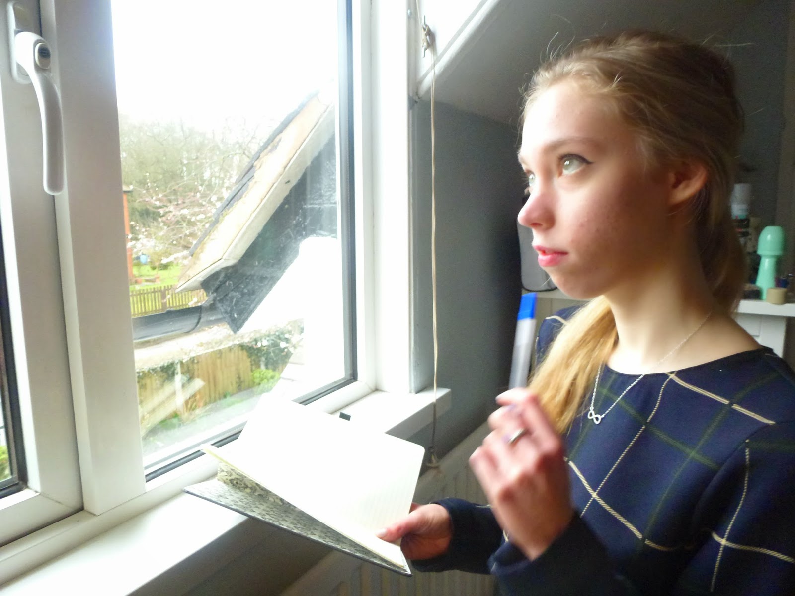
This image is a mid-shot, therefore allowing the audience to see all of the actor. As she is placed to the right of the frame, the emphasis is also on the window she is looking out of. High key natural lighting is also used to maximize brightness and to enhance the shadows on the actresses face. This light and shadow effect makes the actress look sinister as she is in shadow, this connotes to the pen and book she is using, suggesting she has a plan or initiative. The overall picture creates a sense of mystery as the audience wants to know what she is writing/planning.

This image is again a mid shot so the audience gets a clear picture of the surroundings and the actors face. Here, the actor is looking round a door with a scared expression on her face, this could infer that she is being cautious or has seen something 'secret'. High key lighting emphasises the shadows, I achieved this by using the flash on my camera. The 'looking behind the door' pose is a pose typical to a horror or thriller film, therefore the audience can recognise the genre without much more information.

This image provides an obvious connotation with the title. She is seen about to walk through a metal gate, perhaps into an unknown place. This looks like she is running from something or someone. Natural lighting gives an overall ethereal glow to the image whilst the mid shot gives the audience a clear view of the actors facial expression. The title evokes the films genre, a thriller, because of the fast paced connotations. As she is looking directly at the camera, the audience connects with the character.

This image is obviously connoted to the title. I used an image of three people instead of one, this creates more interest. To attract a male audience also, I used males in the image. This image is high action based as I took the image under natural circumstances (i.e not a specialised photo shoot like the other images), therefore it looks like a still from a film.
Subscribe to:
Posts (Atom)